Problem to Solve
Understand the company's culture to actively shape a streamlined process that covers the entire journey from discovery to handoff and systematically structure/define the fundamental building block elements required to the revamp of Design System.
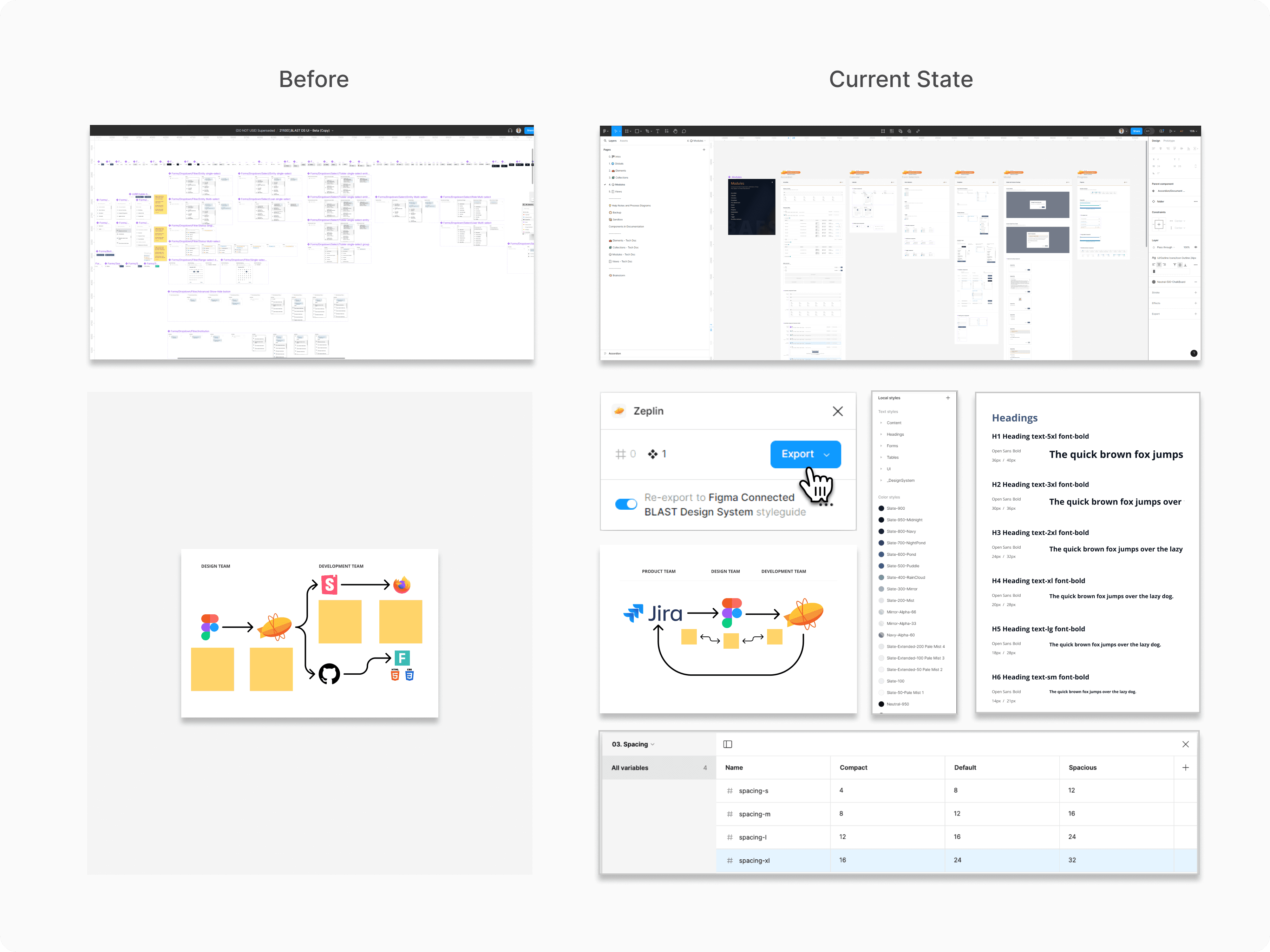
First things first
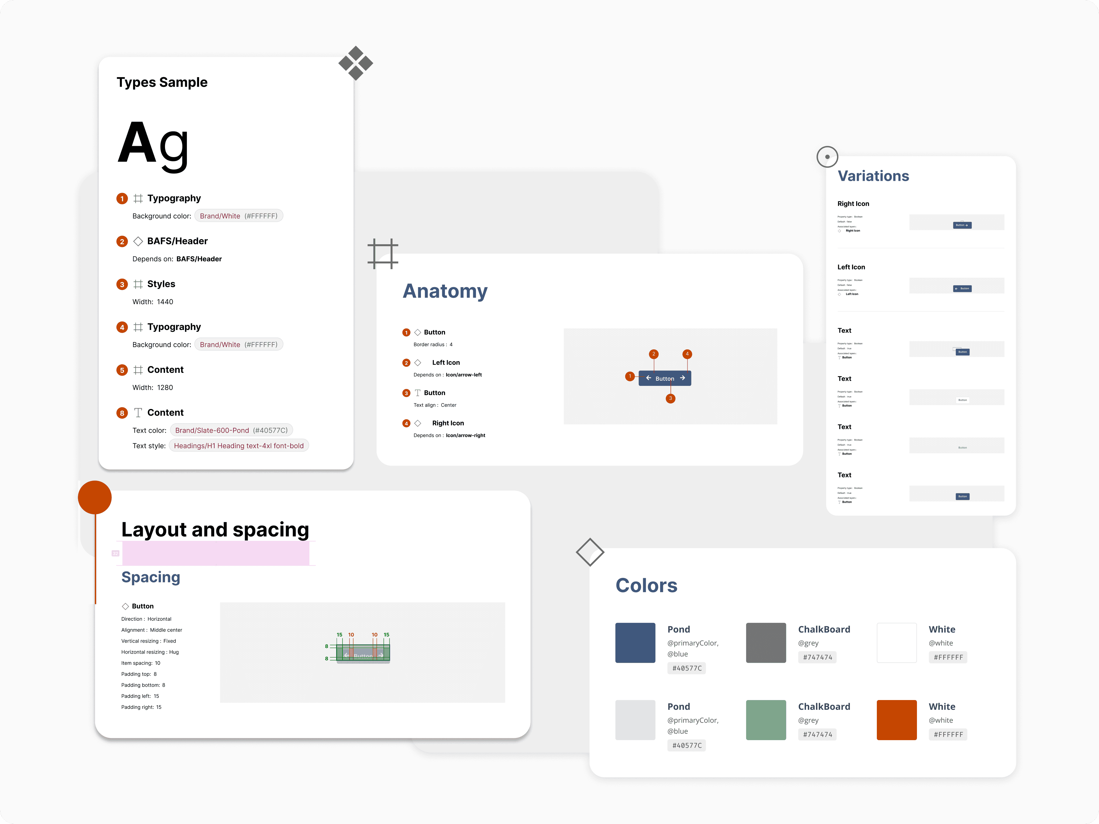
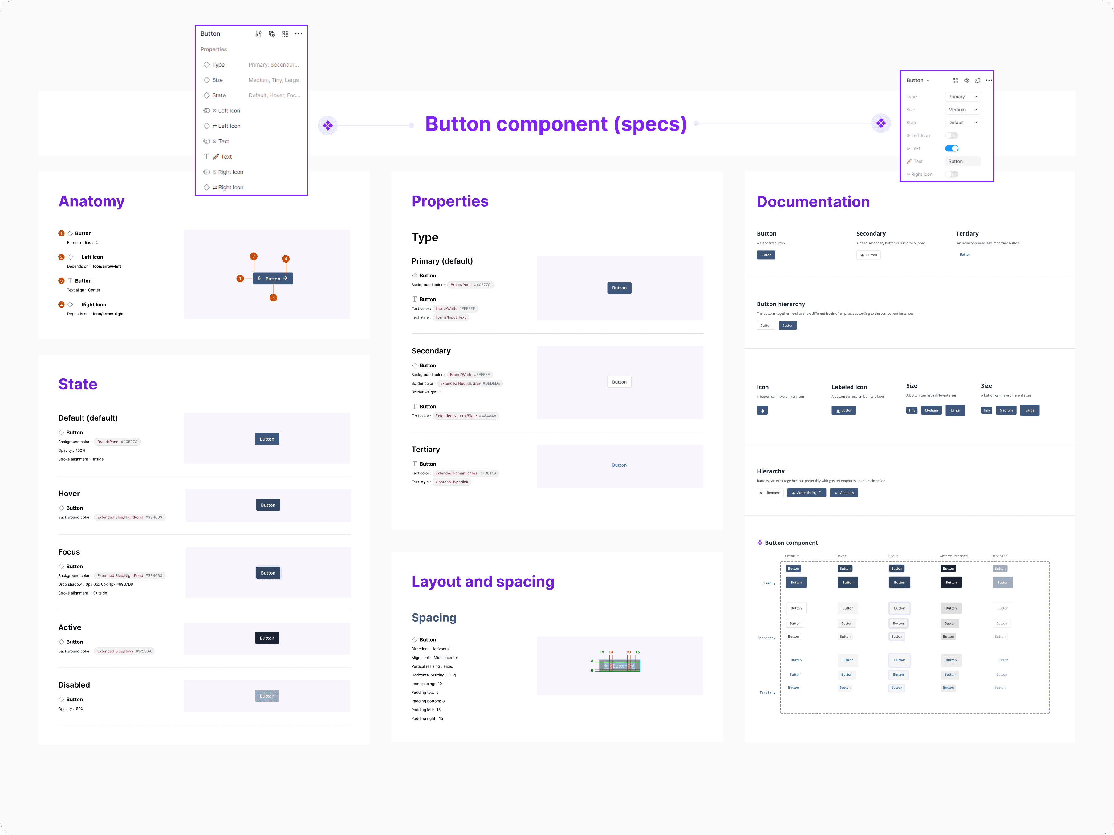
When I first started as a Product Designer at BAFS, my main responsibility was to improve the Company's Design System with a defined and transparent organization method (types of governance and ways to improve documentation). This involved working on various aspects, such as: Refining in use components, strengthening building blocks with slot components, variables/design tokens, auto layout, colors, typography, and simplifying templates with too many variants.
My goal was to follow the principles of Atomic Design before start creating new layouts. This was all about making sure everything looked and worked the same way (with uniformity across all projects). Because Design and Development teams didn't have much time and we already had ongoing projects, It was decided at the time to use an existing framework called Fomantic UI to set up the code foundation and to give us a good starting point to revamp the Design System.
The objectives of this project
Some of the ideas implemented
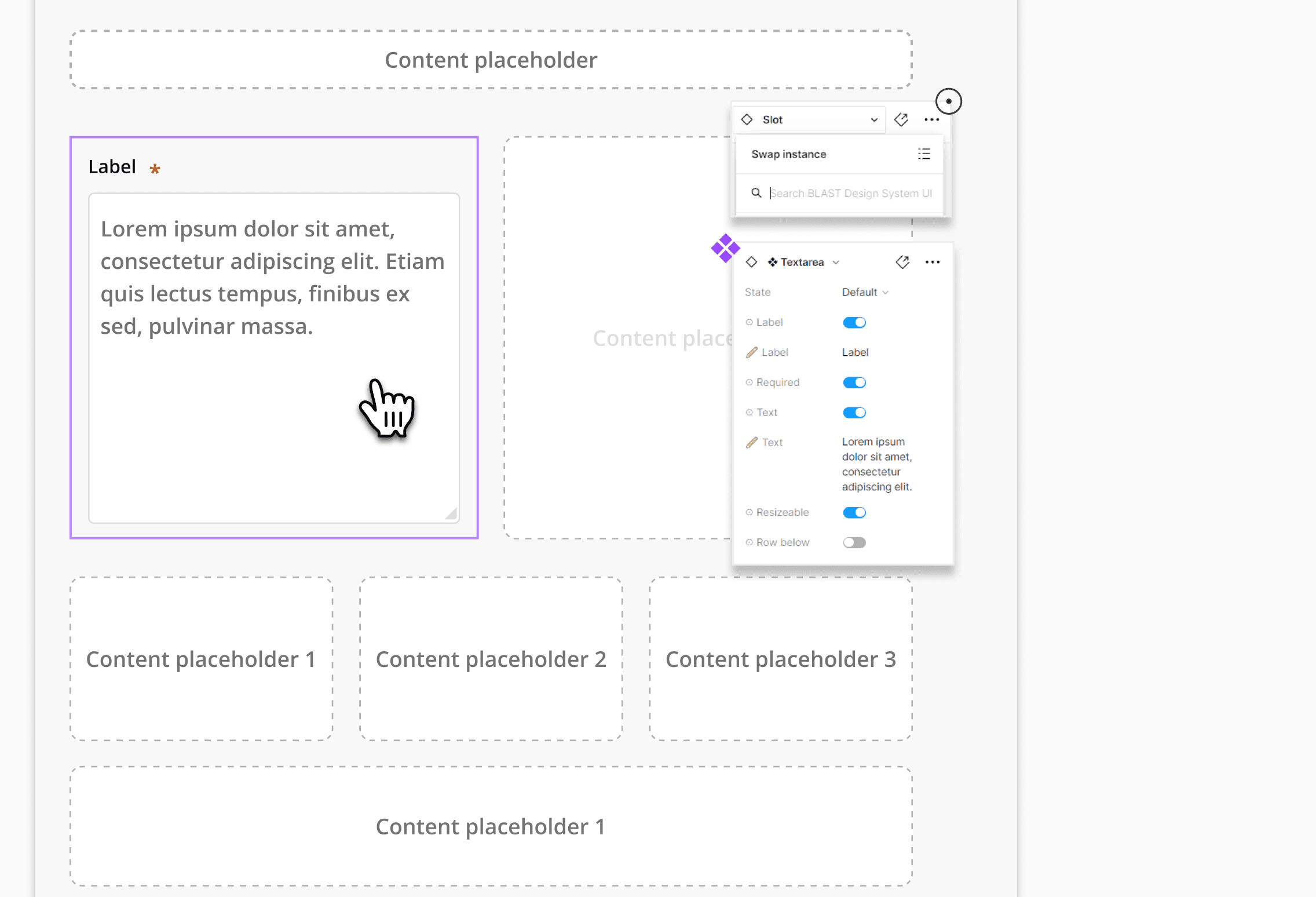
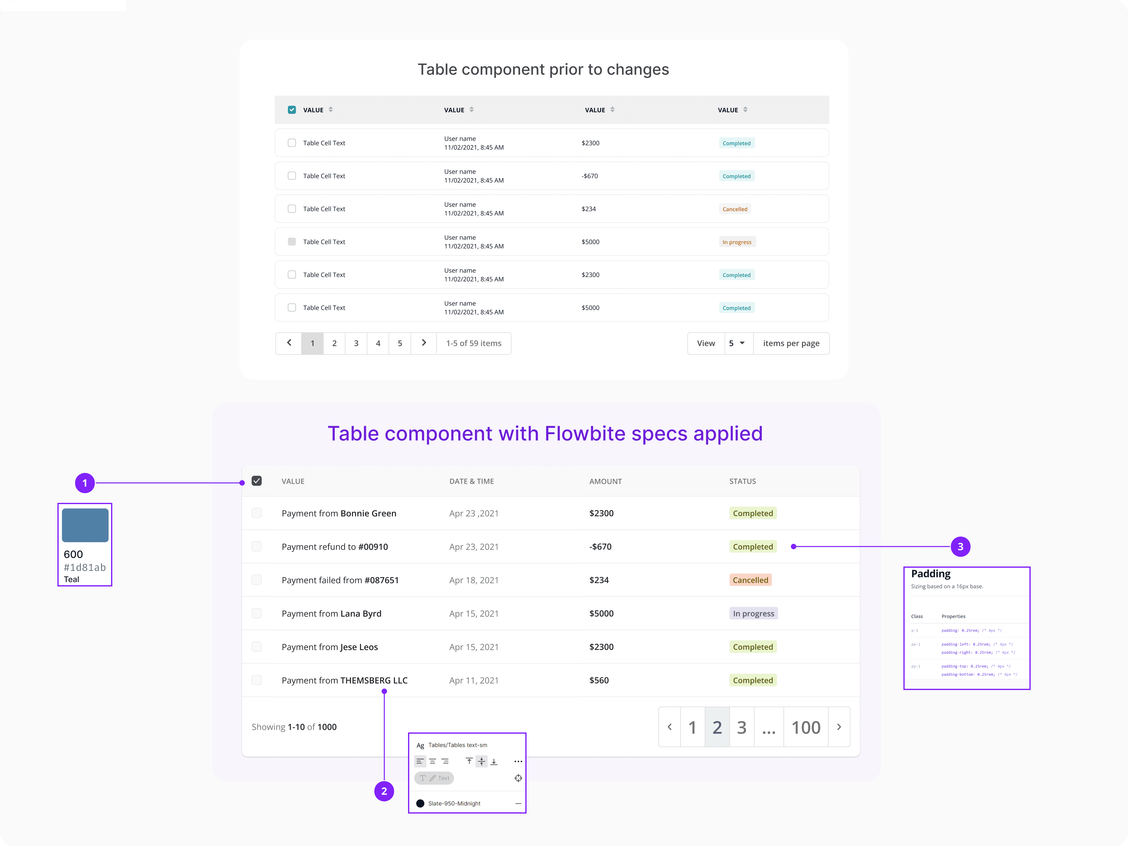
Variables
Allowing the team to have more consistency with the components, flexibility, scalability and efficiency to easily maintain our layouts across projects.
Typography structure
Foundation of visual coherence, establishing a consistent language across projects, while also enhancing readability and setting up hierarchy.
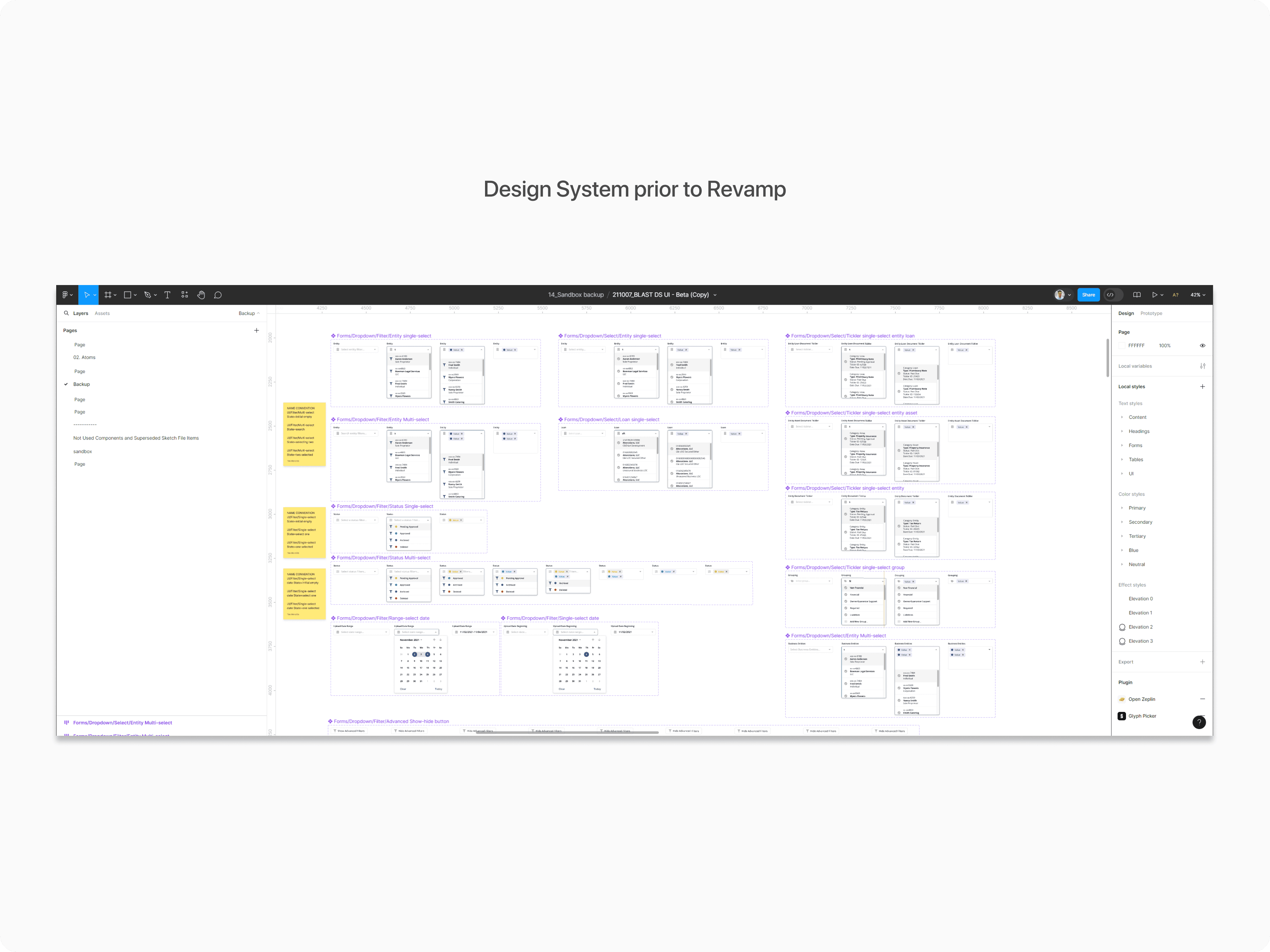
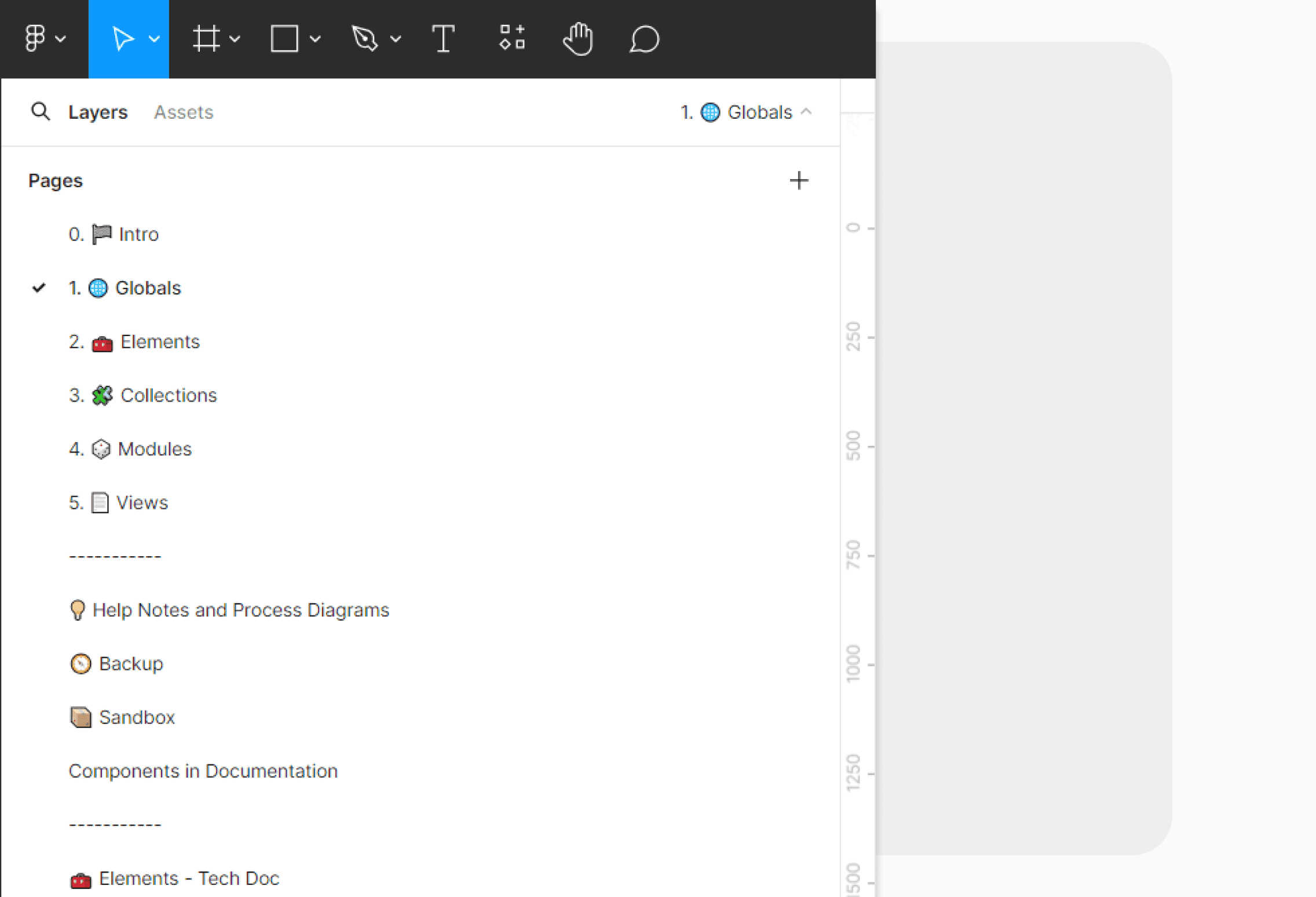
Layers Panel Structure
Utilizing a structured layers panel within pages is crucial for maintaining clarity in design workflows and ensuring easy navigation.
Connection with Zeplin
Keeping our design assets consistent, helps us work better with developers, and makes project handoffs smooth and easy.
Status Labels
Quick insights into project progress, priorities, and any pending actions, facilitating efficient workflow management and decision-making.
Impact & Insights
Implementing a refined design process had a transformative impact on our workflow and outcomes, significantly improving our previous state. By establishing a transparent organizational method, I was able to streamline collaboration and boost efficiency across teams, leading to faster project delivery times and higher-quality layouts. The validation of these efforts was evident in smoother approvals from stakeholders, improved handoffs between design and project managers, and consistently positive internal user feedback on the enhanced user experience.
Overall, these improvements not only validated the effectiveness of our approach but also laid the groundwork for continued success and innovation in our design processes.
Struggles on the way & Reflection
During our codebase development journey, the Design team faced several disruptions due to a demanding schedule filled with the introduction of new features, management of multiple projects, and oversight of a small team. This led to inadequate handoff communication, causing deviations from our intended design patterns and resulting in an inconsistent user interface with mismatched patterns, colors, and spacing.
Despite these challenges, the team remained resilient, continuously implementing fixes and solutions to enhance the platform, even when layouts did not adhere to the established patterns.
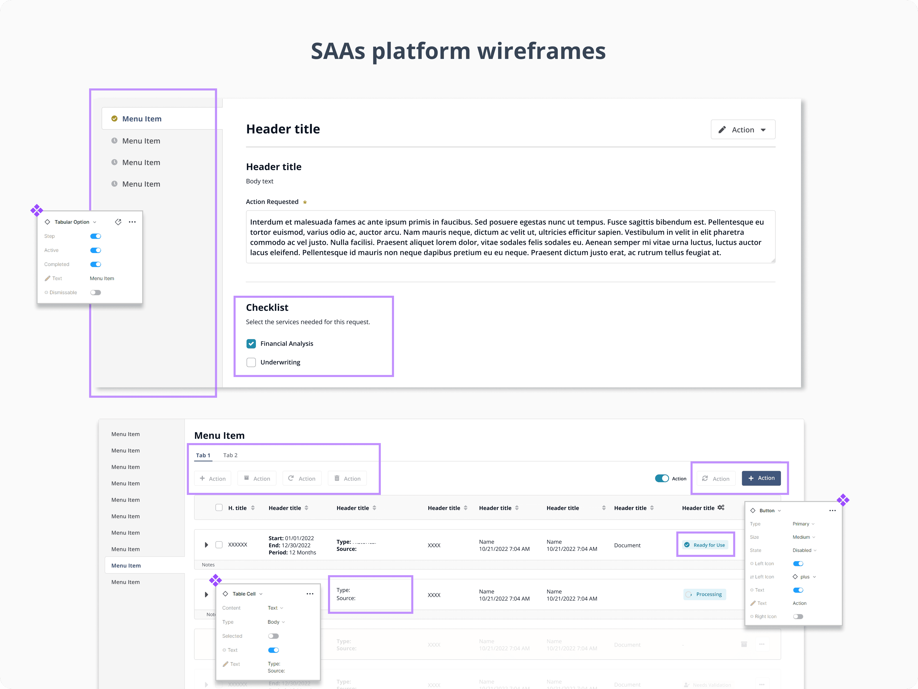
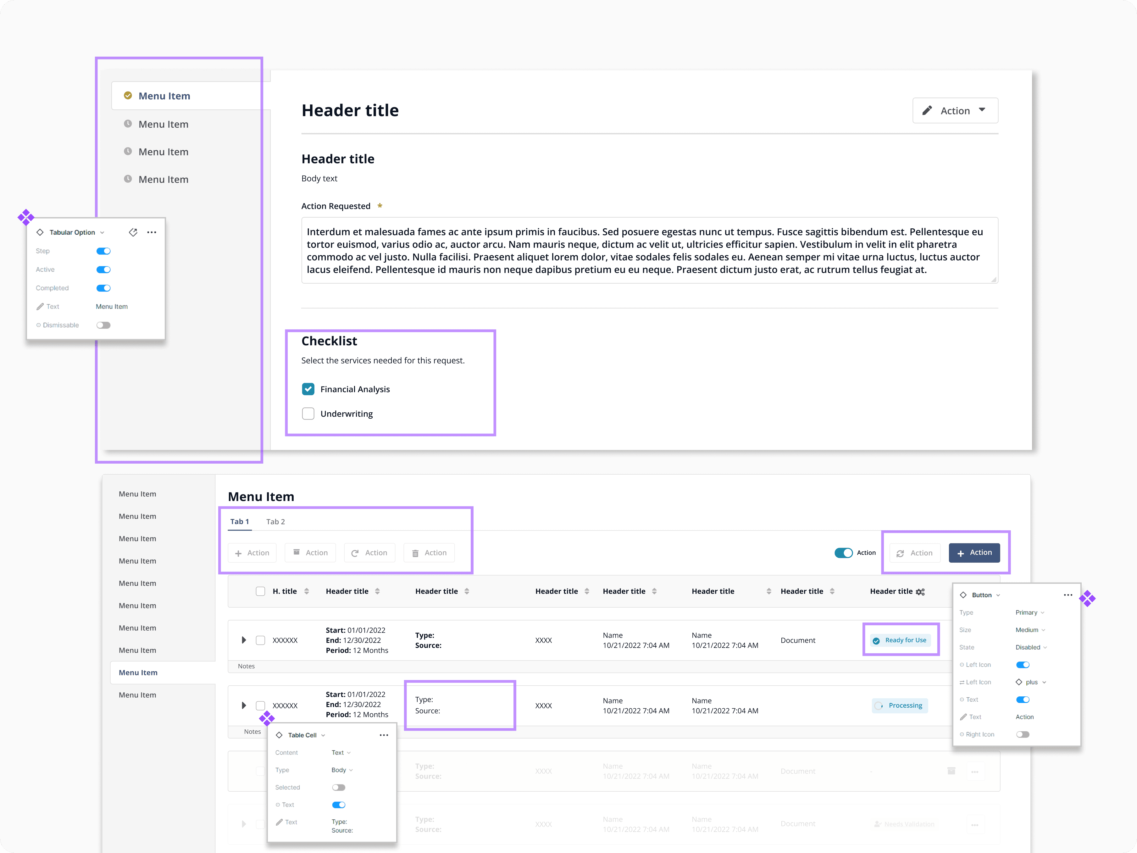
By advocating for the enhancement of our Design System, I learned the crucial importance of collaboration and consistency. This experience not only strengthened my skills but also highlighted the impact of strategic insight and practical implementation in achieving significant advancements for the company's success. To view some of the components used in selected layouts — for which permission to share has been granted, click on the button below the image.
Next Steps
In partnership with the front-end team, the main focus is to integrate Flowbite React components in sync with the Tailwind CSS framework. This shift will ensure consistency and uniformity from the discovery to the delivery stages and restructure the foundation of the current codebase. My primary concern is to align the Flowbite components with our updated Design System, which will use atomic elements. Other goals include understanding REM units, establishing the text base, seamlessly incorporating typography into our coding practice, enhancing productivity, tailwind documentation and aligning design with development.